Planning a 50th birthday party can feel overwhelming fast.
Between decorations, food, invitations, and setup, it is easy to overthink every decision and end up with a party that feels scattered instead of pulled together.
The simplest way to make everything easier is to start with a color palette.
When you choose your colors first, every other decision becomes clearer, from your 50th birthday decorations to your food table to your invitations.
If you want a celebration that feels cohesive, elevated, and easy to pull off, these 50th birthday color palettes are the perfect place to start.
Save this post so you can come back to your favorite idea when you start planning.
Why Color Palettes Make 50th Birthday Party Planning Easier
A defined color palette is one of the easiest ways to simplify your entire party.
Instead of choosing from endless options, you are working within a clear direction, which makes decisions faster and more consistent.
It also helps your party look intentional. Even simple setups feel polished when your colors match.
Most importantly, it prevents overspending on random decorations that do not go together.
If you are searching for 50th birthday party themes or classy 50th birthday ideas, starting with color is one of the smartest moves you can make.
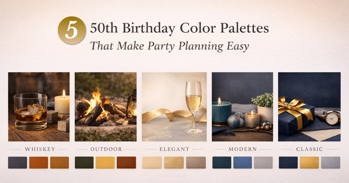
1. Whiskey and Warm Neutrals
Colors: deep charcoal, burnt orange, amber, gold
This is one of the most popular 50th birthday party themes for men because it feels warm, relaxed, and elevated at the same time.
It works especially well for evening parties, whiskey tastings, or smaller gatherings at home.
Easy setup ideas
Use wood serving boards, amber glasses, and warm lighting like candles or string lights. A simple bar cart can instantly become your focal point.

👉 Need food inspiration? Simple Charcuterie Board Ideas for Parties
Why this works
These tones naturally complement each other, so even minimal decor feels intentional.
Avoid this mistake
Do not mix too many competing colors. Stick to warm tones to keep the look cohesive.
👉 Start here to match your theme
2. Adventure Earth Tones
Colors: forest green, mustard yellow, cream, brown
This palette is perfect for a more relaxed, experience focused celebration and is one of the easiest 50th birthday party ideas for outdoor settings.
Think backyard gatherings, fire pits, or casual celebrations with friends.
Easy setup ideas
Layer textures like linen, wood, and simple greenery. Add lanterns or string lights to create a cozy atmosphere.

👉 For more outdoor inspiration
Why this works
Earth tones feel natural and inviting, which helps guests relax and enjoy the experience.
Avoid this mistake
Skip overly bright colors. They take away from the grounded, outdoorsy feel.
👉 Create a cohesive look with this Adventure 50th Birthday Invitation Template
3. Gold and White Elegant
Colors: soft white, champagne gold, beige, warm gray
If you are looking for classy 50th birthday ideas, this palette is one of the simplest ways to achieve an elevated look.
It works beautifully for restaurant parties, formal dinners, or milestone celebrations.
Easy setup ideas
Keep things minimal. White table settings, subtle gold accents, and simple florals go a long way.

Why this works
This palette feels high end without requiring a lot of decor.
Avoid this mistake
Do not overdo the gold. Too many metallic elements can feel cluttered instead of elegant.
👉 Set the tone with this Gold Elegant 50th Birthday Invitation Template
4. Teal and Modern Neutrals
Colors: deep teal, slate blue, warm beige, soft white
This palette is modern, clean, and slightly bold without being overwhelming.
It is a great option if you want a fresh take on 50th birthday decorations that still feels approachable.
Easy setup ideas
Use clean lines, simple signage, and let teal act as your statement color while neutrals balance the look.

Why this works
The contrast creates visual interest without needing a lot of extra elements.
Avoid this mistake
Do not introduce too many accent colors. Let teal be the standout.
👉 Keep everything cohesive with this teal 50th Birthday Invitation Template
5. Navy and Gold Classic
Colors: navy blue, rich gold, white, charcoal
This is one of the most versatile and timeless 50th birthday party themes.
It works for almost any venue, from large parties to more formal celebrations.
Easy setup ideas
Combine navy table elements with gold accents and simple white details to keep everything balanced.

👉 For more classic party inspiration
Why this works
It is polished, widely appealing, and easy to execute.
Avoid this mistake
Be careful not to mix too many shades of gold. Consistency is key.
👉 Start with a matching design
How to Choose the Right 50th Birthday Color Palette
If you are not sure which direction to go, start here.
Think about the personality of the guest of honor.
Do they prefer something relaxed, bold, or elegant?
Consider your setting.
Outdoor parties pair well with earthy tones, while indoor or restaurant settings lean more formal.
Keep the size of your party in mind.
Smaller gatherings allow for more detail, while larger parties benefit from simpler designs.
Keep It Simple
The biggest mistake people make when planning a 50th birthday party is trying to do too much.
You do not need elaborate decorations or dozens of elements.
Instead, focus on just a few key areas
A simple food setup
A drink station
One styled focal point
When these align with your color palette, your party will automatically feel more put together.
This is one of the easiest ways to create a beautiful 50th birthday party without unnecessary stress.
Make Planning Even Easier
Once you choose your color palette, the next step is simple.
Start with an invitation that already matches your theme.
It sets the tone, guides your decor decisions, and makes everything feel cohesive from the beginning.
Leave a Reply